PROPOSAL
I have decided to create a series of advertisements (maybe 4)
that would be seen on buses and in subway cars. My audience would be everyday
people who are interested in starting or continuing a healthy lifestyle and in making
smarter choices about their food. I think the viewer profile is a lot large now
because the people who generally look at these ads are just people, of all ages
and backgrounds, who use public transportation. However, I aim to interest
people who think the facts presented in the ad are worth noting and acting on;
it may be health-nuts who are looking for additional tips to boost their active
lifestyle or it may be unhealthier people who are looking for ways to change
and make decisions concerning their body and health. Similar to my re-purposing
project, my goal is to educate and inform people about the social and
environmental factors that influence our food intake so that they are more
aware of these details, regardless of whether or not they’re actually
overeating, as it is useful to know about the things that affect health.
I plan to use InDesign or Photoshop to create these posters. I will play with both over the next few weeks to see which one is more user-friendly and appropriate for the layout I have in mind. Both are easily accessible on Mac desktops located in the school libraries so I can work from there.
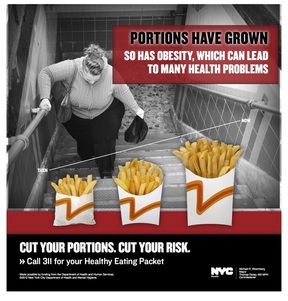
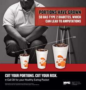
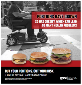
I am using a NYC Department of Health Ad Campaign on increasing portion sizes as a model for my own ads; here are three samples:
I plan to use InDesign or Photoshop to create these posters. I will play with both over the next few weeks to see which one is more user-friendly and appropriate for the layout I have in mind. Both are easily accessible on Mac desktops located in the school libraries so I can work from there.
I am using a NYC Department of Health Ad Campaign on increasing portion sizes as a model for my own ads; here are three samples:
|
|
|
The subject of this ad campaign is very similar/related to my project on food so I definitely think this model will be extremely helpful in helping me figure out what aesthetic and rhetoric qualities are effective in creating eye-catching persuasive ads concerning health.
This website provides a lot of creative advertising ideas. These ads are definitely different and innovative, which is what draws people to stop and look/read them. Some are humorous while others are surprising (creative presentation of a familiar/old topic). I’m not sure if I want to be humorous in mine, but I definitely aim to surprise and make people think “Wow! That’s really cool/interesting!” when they seem my posters. Similarly to the one above, I plan to use these examples to gain ideas on how to attract attention.
The ideas I plan to present (as laid out in my re-purposing project) are:
1) Large vs. small plates
2) Tall narrow vs. wide short glasses
3) Color contrast b/w plate and table & plate and food
4) Organized vs disorganized food on a plate
5) Visible food vs. food hidden behind a door
I haven’t yet decided if I plan to take these photos myself or to use available photos online that exemplify my idea (depending on what images I am able to find that accurately represent my idea, probably a mix of both). I would like to do side by side comparisons (somewhat similar to the third model mentioned above) to show that illusions are based on perspective and appearance. I hope to have most of my images and creative slogans by the time the storyboard draft is due and to continue to solidify my organization and layout of the posters as the due date for the first draft approaches.
